


Pit’sa: where uniqueness is common
Pit’sa is a project born in Bergamo, Italy after the intuition of entrepreneurs Giovanni Nicolussi and Valentina Giacomin.
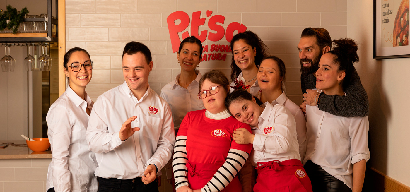
We took their purpose and turned it into a functioning business: an inclusive environment in a medium-sized Italian city where good, sustainable vegan pizza is served every day with a smile. Their inclusivity is pervasive: it goes from hiring workers with Down syndrome to offering products that can be eaten by customers with a wide range of dietary restrictions.
Our challenge? Making their uniqueness non-pretentious and light, just like the owners and staff.
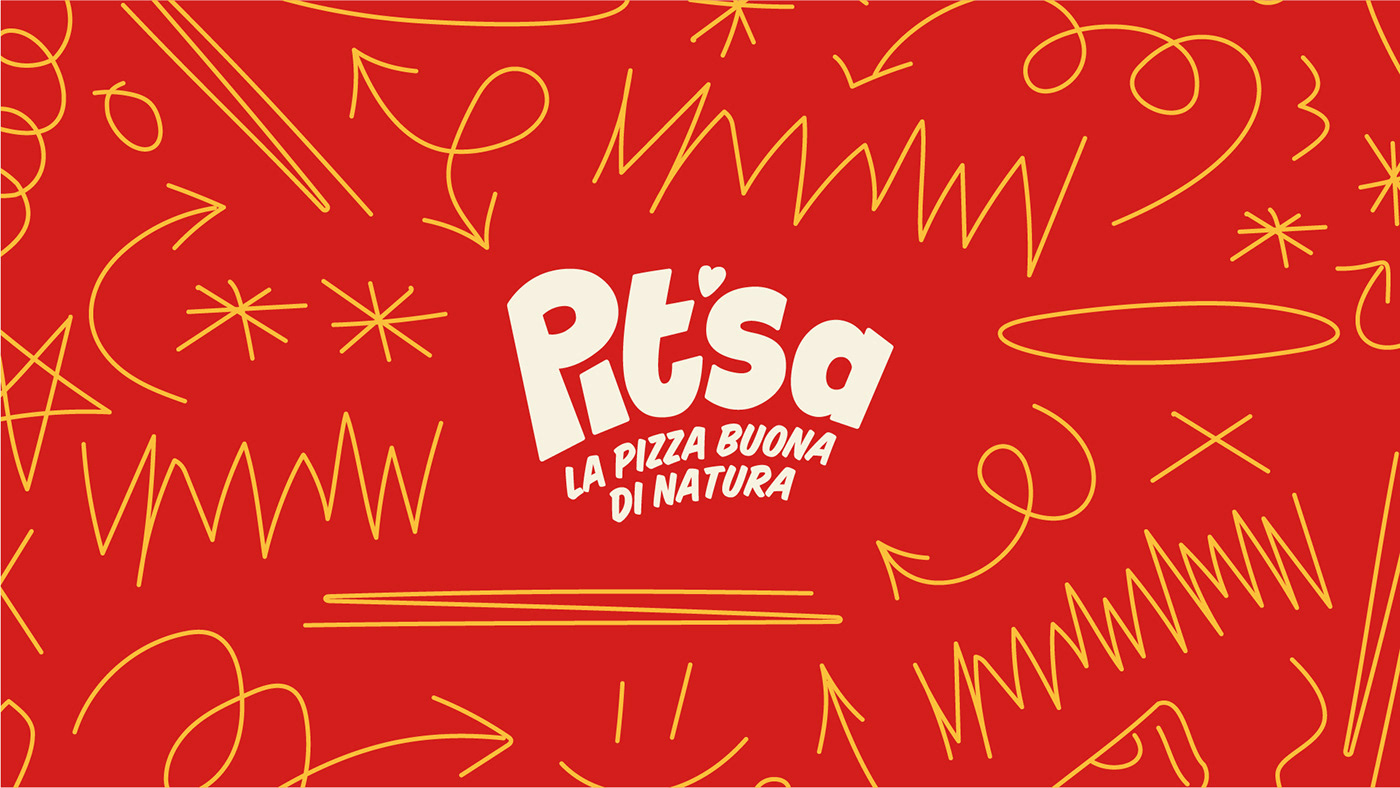
Starting from the naming, we had the goal of communicating how things can look different, but they’re inherently the same; that’s how the name “Pit’sa” was born, since it is the way the IPA pronunciation of the word “pizza” is written.
At the same time, we worked on Pit’sa visual identity. We based it on three rich, playful colors: red, green and yellow. We worked on the themes of simplicity, happiness and discovery, designing fun shapes and lines that entertain the eye. The lettering and visual elements are aligned to the brand identity and respect its values. The logo and illustrations are hand-drawn to keep a more physical and spontaneous feel, and every piece of content is both designed and meant to be enjoyed playfully.
At the same time, we worked on Pit’sa visual identity. We based it on three rich, playful colors: red, green and yellow. We worked on the themes of simplicity, happiness and discovery, designing fun shapes and lines that entertain the eye. The lettering and visual elements are aligned to the brand identity and respect its values. The logo and illustrations are hand-drawn to keep a more physical and spontaneous feel, and every piece of content is both designed and meant to be enjoyed playfully.
The result is joy all over: this way, the staff, customers and followers alike can perceive how much energy and care was put into this project from the very beginning. After all, acceptance can really be light and easy!


Art Direction: Roberto Morandi
Copywriter: Domingo Iudice, Teresa Serripierro, Pietro Minniti
Content Graphic Designer: Roberto Morandi, Giuseppe Cappiello, Francesco Paternoster
Motion Graphic Designer: Claudia Maltese
Motion Graphic Designer: Claudia Maltese
Photographer: Nicla Marzano
Social Media Manager: Manuela Mastrangelo


